Crazy to think about, but on May 11, 2011 I got a friendly email from a somewhat desperate Mitzvah planning mom out of Albany, New York. She was starting to plan her daughter’s Bat Mitzvah, and spent hours upon hours on trying to find inspiration on the web. (Sound familiar?) Julie (Mitzvah mom) needed assistance on the creative direction. When we had our first conversation, which lasted about an hour it was clear that there was a concept that they had in mind. I was given the following description, “Emily is into all things food, gourmet and cooking. As in Emily’s the restaurant and she loves bright colors and wants it to be fun. She loves turquoise, orange, yellow or purple”. This was the information and then I got to work! As I tell all of my Mitzvah planning families…concentrate on one thing at a time…the logo is always a great way to set the creative direction!
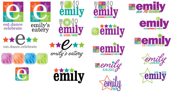 The logo on the top right was the winner! But many iterations of that logo were used throughout the event.
Next up…Save the Dates! Since their out-of-towner list was plentiful, and there was a lot of information between hotel blocks, welcome dinner, transportation, airport details, etc… The family didn’t want their guests to know too much about the theme, hence why there were 4 stars as part of the logo. Think 4-star restaurant! Get it? 😉
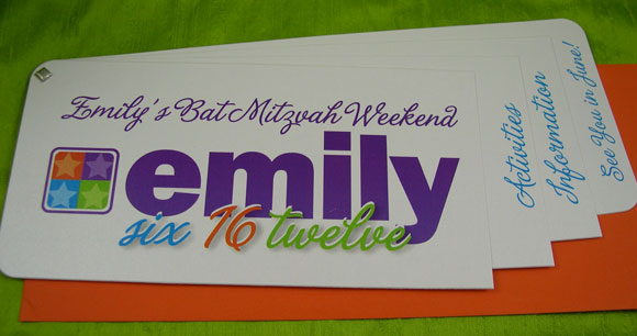 Pantone style Save the Date with bright orange open-ended envelope and custom address label.
Logo…check!…Save the Dates in the mail…check!…the buzz starts….
Now for the very highly anticipated invitation! (Not too much pressure on this graphic designer!)
Many ideas went back and forth between my client and myself. One thing I knew was that they didn’t want an invitation in a paper envelope. They wanted something in a box, wanted it fun, but also wanted to make sure that the invitation portion was more of a “traditional” looking invitation.
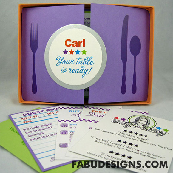
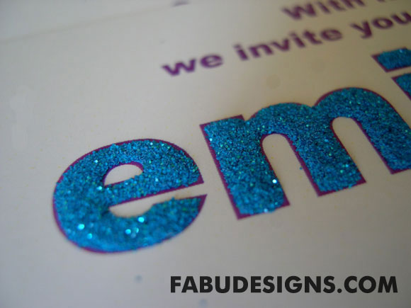
The above is what I ended up creating. Each invitation was personalized to each recipient. The WOW factor was “emily faith” hand embellished with ultra fine blue glitter.
If you would like to see additional pictures of this invitation, please click on: Emily’s Bat Mitzvah Invitation Post.
Next up…accessories! For the event, everything had to tie in together. The whole premise, was that their guests were going to the grand opening of Emily’s Eatery so all accessories had to do with a restaurant. The below 3 pictures were the place cards/menu cards.
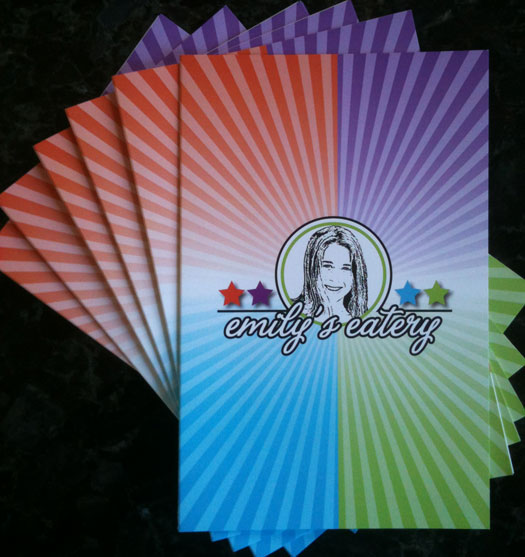
Front of menu card/place card. It mimicked the front of a menu from a restaurant.
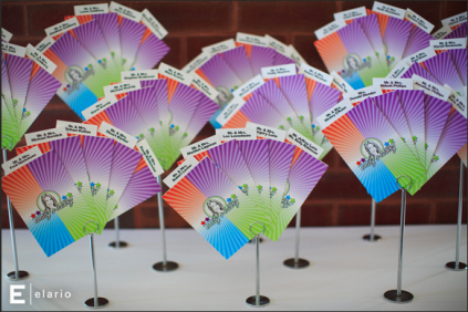
All of the menu card/place cards displayed on a table. The names were on the back of the guest checks that were inside the menu. Photo courtesy of Elario Photography.
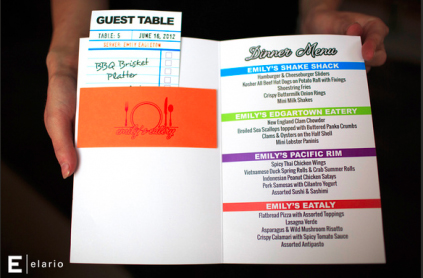
The inside of the menu card/place card. Each menu had a guest check with table numbers that corresponded to a meal that Emily loves! Photo courtesy of Elario Photography.
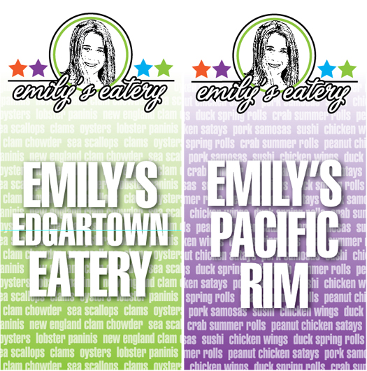
Since the Mitzvah family didn’t want a formal event, they decided to have food stations instead of a seated dinner. There were 4 stations of food and the following were some graphics that designated where all of the food stations were in the ballroom. Each sign was 6′ x 12′.
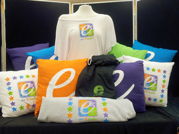
For the kid’s favors, I teamed up with APromosUSA/The Imagemaker to design the logos for the white girls shirt and black athletic boy short.
If you would like to see additional pictures of how this event came all together, check out Emily’s Eatery Bat Mitzvah Family Spotlight on MitzvahMarket.com